Data Visualization with Python

Introduction
Data visualization is one of the key components in being able to understand data, as a data scientist. Why is it so important? In this blog, I would show you how data visualization can help you identify all kinds of interesting parts of your data such as outliers, spikes, groupings, tendencies, and more, that can help you realize how your data looks graphically.
In this blog, I would like to use Matplotlib and Seaborn which are quite popular libraries for data visualization in Python.
Visualization Distribution
There are a couple of ways to dig into data, among these is by looking at its distribution, or how the data is organized along an axis.
Loading dataset
The example below uses a diabetes prediction dataset in a CSV file format. You can download it here
import pandas as pdimport matplotlib.pyplot as pltimport seaborn as sns

df = pd.read_csv('data/diabetes_prediction_dataset.csv')df.head()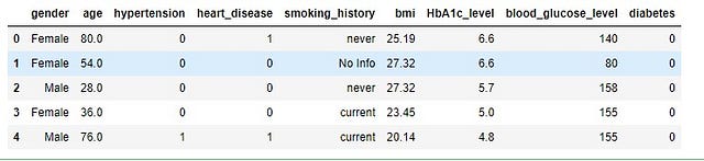
let’s filter a person with an age greater than 30, then plot a histogram for the distribution
filtered_df= df[(df['age']>30)]filtered_df['age'].plot(kind='hist',bins=10)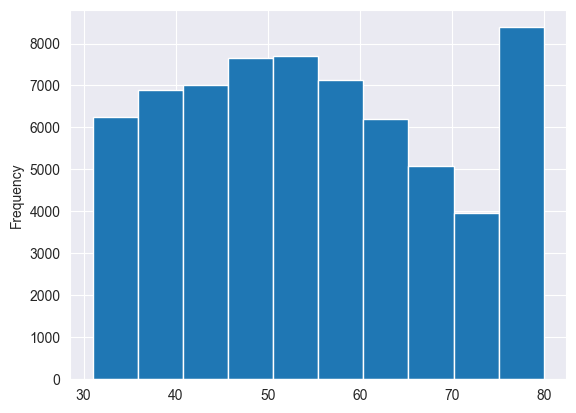
Create a 2D histogram showing the relationship between age and blood glucose level.
y = filtered_df['age']x = filtered_df['blood_glucose_level']
fig, ax = plt.subplots(tight_layout=True)hist = ax.hist2d(x,y)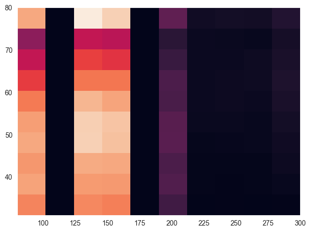
let’s work with the filtered dataset, and create a labelled and stacked histogram superimposing blood status with Hemoglobin A1c test
x1 = filtered_df.loc[filtered_df.gender=='Male', 'HbA1c_level']x2 = filtered_df.loc[filtered_df.gender=='Female', 'HbA1c_level']
kwargs = dict(alpha=0.5, bins=20)
plt.hist(x1, **kwargs, color='red', label='low')plt.hist(x2, **kwargs, color='orange', label='high')
plt.gca().set(title=' Status', ylabel='Hemoglobin A1c test')plt.legend();
It is now time to use work with Seaborn, to create a smooth plot about HbA1c_level by showing data density
sns.kdeplot(filtered_df['HbA1c_level'])plt.show()
let us show the blood glucose level mass density per smoking history:
sns.kdeplot( data=filtered_df, x="blood_glucose_level", hue="smoking_history", fill=True, common_norm=False, palette="crest", alpha=.3, linewidth=0,)
Create a 2D kdeplot comparing heart_disease and hypertension with hue showing diabetes status
sns.kdeplot(data=filtered_df, x="hypertension", y="heart_disease", hue="diabetes")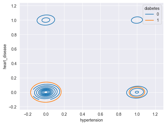


Comments